I’ve created a CMS list with drawings (Projects Template) that are displayed in a masonry-style grid. I’ve utilised Macy.js to create that. It works great on desktop- however, the drawings are not showing on mobile. I’m not skilled in Javascript so not sure how to alter it to make it work. Link to the website below. Any thoughts on it would be super appreciated- thank you for all your help in advance!
Hey @Support-Luis, on desktop the drawings are displayed in a masonry, two-column grid. On mobile, they are set to be displayed in a single column. Currently, the drawings are not showing up at all…
Here’s also a link to the staging site as well so that you can see the query on mobile: Website
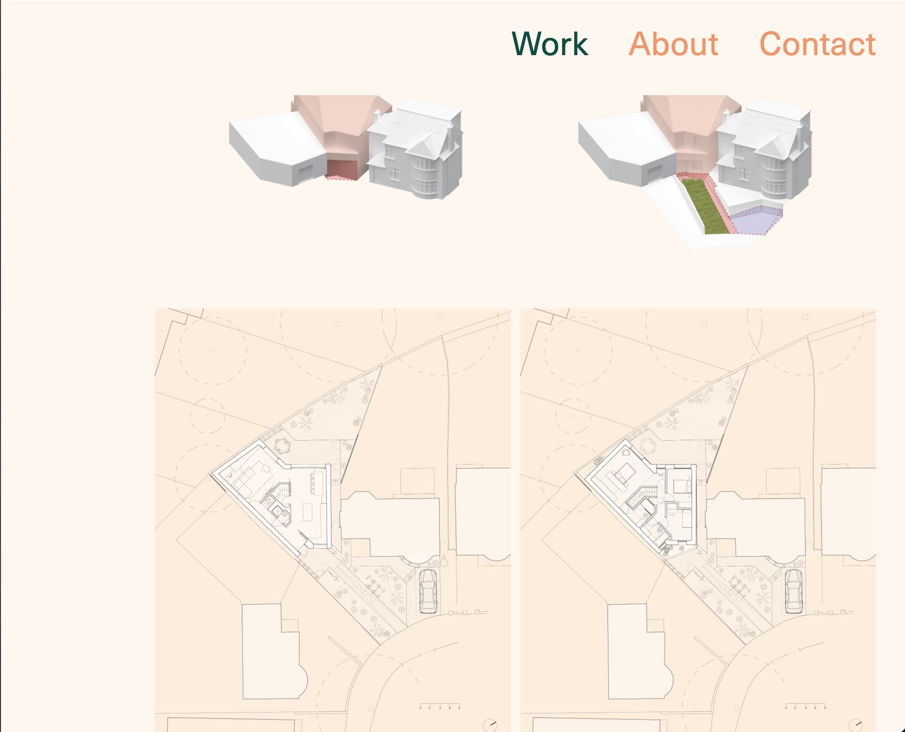
@tinwid do you mean these drawings? Couldn’t the same result be achieved by using display: flex and changing from horizontal to vertical direction depending on the breakpoint?
@Support-Luis I have tried this method- since the sizing of the drawings vary, sometimes the flex direction creates random spacing between drawings which is not desired… that’s why I went for macy.js. It was also important to ensure the drawings read row first, column second- so that some of the sequential diagrams are laid out as intended. Hope that makes sense?
@Support-Luis great, thank you so much- i really appreciate it. I tried to play around with another CMS collection and it seemed all okay. it would be great to get your input and see why that particular CMS template is misbehaving. all the best!